a call to action to minimise damage to New Zealand’s precious freshwater system.
Project
Splash Smarter
Partner
Liam Collinson
Institution
Massey University
Wellington, New Zealand
Duration
6 weeks
New Zealand’s rivers and lakes are quickly deteriorating due to the effects of stormwater pollution. Splash Smarter is an initiative that aims to develop small household habits that will make a world of difference to our waterways. With a fresh, fun and colourful aesthetic that is unintimidating, Splash Smarter creates a space for change. My partner and I fully coded the website from scratch.
animations
website
project brief
We were tasked to select an issue facing the New Zealand public and develop a website that would inform the audience of the issue, as well as small things they can do to make a difference. Animations were to be incorporated within the website.
background
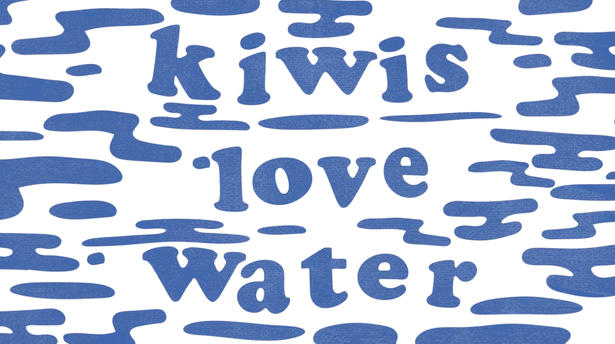
New Zealander’s pride themselves with their home’s beautiful mountains, landscapes and waterways. However, nearly half of our rivers and lakes are badly polluted, preventing Kiwi’s spending time in the outdoors, threatening native species, introducing unwanted species and contaminating our seafood. One of the primary causes for these devastating effects is stormwater pollution, 80% of which results from careless domestic practises.
Summers spent by our lakes and rivers are a cherished part of Kiwi lifestyle.
strategy
People are often left feeling helpless in the face of large environmental issues like this threatening their homes. Our approach to this project revolved around providing accessible solutions through unintimidating, friendly and optimistic visual communications. We chose to target young homeowners, as this group would be flexible in developing long term household habits. However the approachable presentation of information encourages wider engagement.
process
research phase
A large chunk of time was dedicated to researching the issue, gathering content about both the current situation and what household owners could do to minimise their contribution to stormwater pollution.
visual phase
Creating the visuals for Splash Smarter involved a lot of thumbnailing, iterations and critiquing before settling on a final look. We focused on the website first and extended the visual language into the animation.
Early moodboard exploring our visual approach - we were particularly interested in the idea of abstracting water in a fun and dynamic way.
Early character concept sketches - we wanted to use simple line work to create a character with a friendly, humorous demeanour.
Early wire framing of website concepts.
Rough digital developments of wireframes.
To add visual interest we created gifs for the illustrations on the website that would move upon hover.
Gif to accompany information about unwanted algae.
Gif to accompany information about composting yard waste.
Annotated storyboard for first animation. Despite having a video dedicated to the overarching problem we focused on incorporating a lot of of optimism and humour to keep the viewer engaged.
Using the storyboard as a guide we extended the visual language with more illustrations and character development. Sound played an important role in our animations. We chose to create the soundtrack ourselves so the animation could be more dynamic, this enabled us to emphasise certain moments and create elements of humour with the character. The stripped back Island style sound fits with our water and summer themes.
design solutions
The final website and animations engage and motivate users to adapt to better household water practices, such as washing your car on the grass or composting yard waste, that will reduce our impact on New Zealand’s precious rivers and lakes.
We have taken multiple approaches to prevent users feeling overwhelmed with the extent of the problem. The aesthetic is fun colourful and fresh, achieved through a minimal bright colour palette and lots of negative space. This enables us to frame a negative situation in a positive light, as well as appealing to our target audience without becoming patronising. The illustration style is also unintimidating with a likeable character developed throughout. Adding texture helped to create depth and also has an organic look, relating to the environmental aspect of the situation.
The website utilises interactive features that engage the user and support the information provided. The text is categorised and separated within supporting illustrations, making potentially overwhelming information digestible.
Consistency is developed between the animations and video through the use of our statement font, colour palette and illustrations. This packages our website into one cohesive brand which can hold its own amongst many eco-awareness initiatives today.
software used
Adobe After Effects
Adobe Illustrator
Adobe Photoshop
Brackets for HTML, CSS & Javascript